They don’t design #Strands like Saul Bass and Paul Rand used to.
I share my daily word game results in rapid-fire posts on Mastodon. I’ll include a quick pun, wordplay, or topical reference that hints at the day’s puzzle. Sometimes, I’m too on the nose and spoil it for people. (Sorry.) Mostly, I’m just obtuse and no one understands what I’m going on about. Welcome to my timeline: Come for the trenchant observations, flee with dismay when I flood your timeline with this noise.
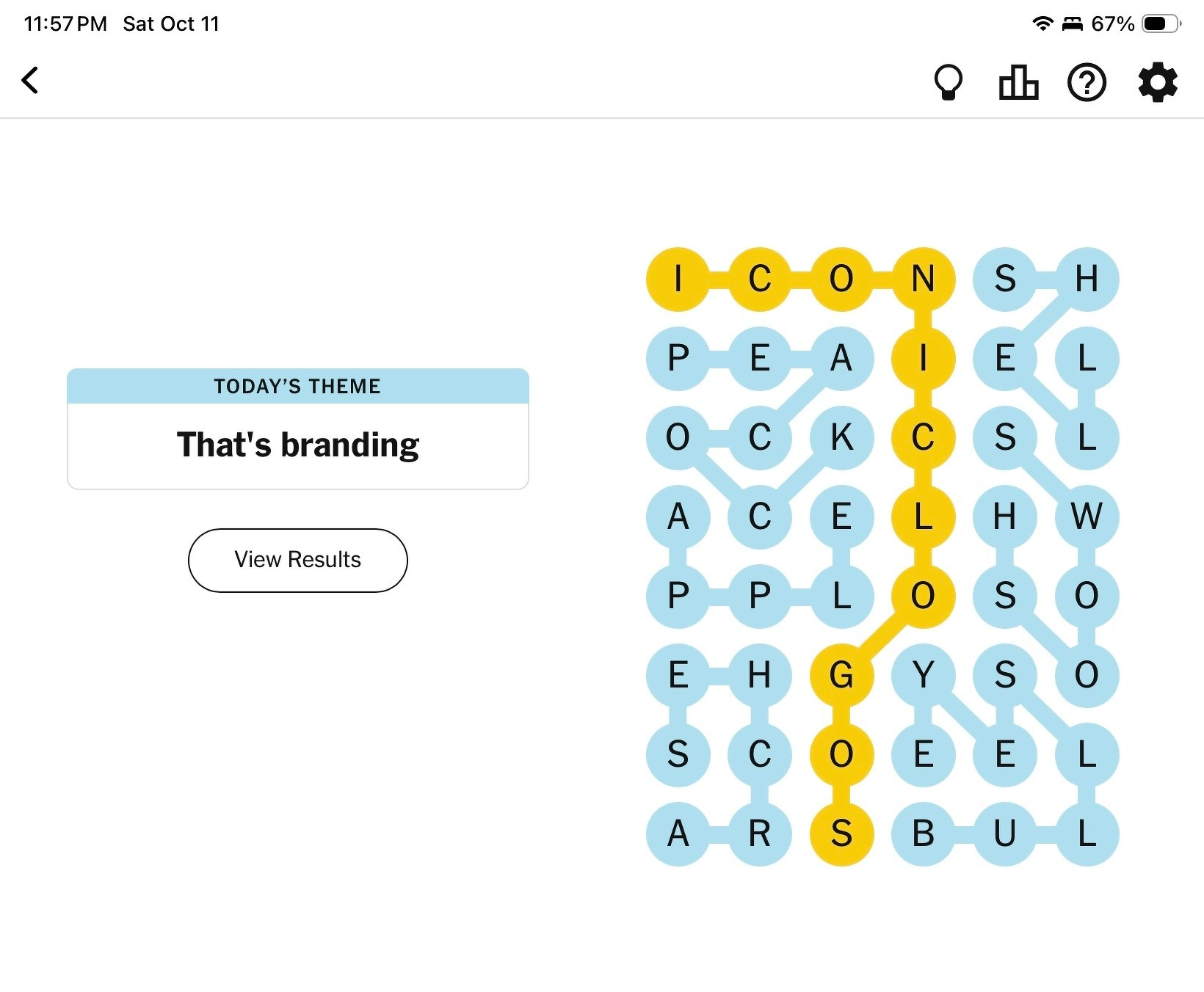
So, Strands is The New York Times’ daily riff on classic word-search puzzles. Find several themed words in a letter grid, all connected by a “spangram” that describes the category. It’s a pretty simple game, and I try to marginally up-level the difficulty by finding the spangram (🟡) first.
Usually, a brief social share is all I need to feel I’ve accomplished my day’s duty. But once in a while, I get wildly sidetracked by what the puzzle and my silly, one-line commentary bring to mind. Yesterday’s was one.
A Little Too Iconic. And Yeah, I Really Do Think
The theme (spangram: “ICONICLOGOS”) activated the part of me that loves thinking about brand design. You know I always wanted to pretend to be an architect. “Iconic” is overused to the point of triteness when talking about design, but the puzzle’s answers don’t lie: BULLSEYE, SWOOSH, ARCHES, APPLE, PEACOCK, and SHELL.

|
After posting my quip on Mastodon about the Strands puzzle, I was kind of shocked to learn that none were designed by the mid-century design legends Paul Rand or Saul Bass. But the influence of Rand, Bass, and a few others among their peers on how we think about branding and corporate identity today is absolute. The designers’ collective work for IBM, ABC, AT&T, United Airlines, and seemingly every other capital-C corporation proved that the right symbol can encompass and convey a company’s entire worldview.
You definitely can see that lineage in today’s puzzle grid. Most of these are descendants of earlier, fussier marks. They’ve been successively simplified to minimum forms that embody clarity, memorability, and assertiveness.
- Target’s bullseye and Nike’s swoosh focus on bold movement and action.
- McDonald’s arches and Apple’s fruit are drawn with curves that simultaneously are idealized and somehow humane.
- NBC’s peacock and Shell’s scallop employ visual rhythm and the strong presence of color to balance geometry with warmth.
Those qualities reflect a shared inheritance from Rand and Bass. They were contemporaries, but their styles were distinct. As far as I know, they never collaborated on a project. I deeply admire Rand’s work, but Bass was perhaps a more flexible designer. His style, originating in film title design, was varied and evolved more obviously as stylistic mores changed over time.
That’s No Moon
I always had thought Rand designed the Bell System logo of 1969—a perfect circle enclosing a simplified bell, embodying mid-century faith in geometry and order. It spoke of authority and technological certainty, as consistent and rational as the monopoly it represented. As a child of the 1970s, that Bell means “telephone” to me in a way nothing else does. But it was Bass’ and team’s work, and the story doesn’t stop there.
In the wake of Ma Bell’s antitrust breakup fourteen years after his original design, Bass was asked back and given a different remit. For the new AT&T, he developed a forward-looking blue globe to signify the change; his old Bell System logo was relegated to the divested, staid regional bell operating companies.
|
Saul Bass — Bell System (1969)
Stable, centralized, communication as institution.
|
Saul Bass — AT&T Globe (1983)
Dynamic, connected, communication as movement.
|
Bass’ new design used deceptively not-quite-geometric, hand-drawn blue bands that suggested pulses, connection, and communication. It encapsulates a hallmark of how his style evolved over the decades: a sense of movement in a logo that didn’t want to be stamped in concrete or embossed in relief on a product assembly line.
And there’s continuity, too; both perfectly round, both in the same blue. But I’m not sure Bass’ 1983 globe can stand on its own without the “AT&T” lockup. His 1969 bell certainly did.
That former Bell System logo was solid and Platonic: communication as institution. Bass’s blue globe was dynamic and a bit off-center: communication as movement. The swap mirrored their eras. The aesthetic of the 1960s corporation told us to trust in the system. 1980s marketers encouraged us to look forward with expressiveness and change.
40 years on and after a reverse merger in which one of AT&T’s progeny devoured its mother, updates to the AT&T brand have kept Bass’s core idea, but each iteration has been far less durable, employing gimmicks like 3D renders or a coat of faux reflective gloss. The current logo by Interbrand is a digital beach-balling of Bass’s globe. I’m not a fan.
You also could argue that the typography of the AT&T wordmark that accompanies the globe follows the same path: from the assertive Helvetica, to a somewhat more conversational AT&T Gothic, to the assuredly transient ClearviewATT, Omnes, and AT&T Aleck.
The More You Hear, the Better We Sound
Some links to how these marks have been tended and mythologized:
- Apple: For a company that tightly controls branding at every layer of its customer experience, Apple doesn’t make it easy to find much about its official logo, though it’s happy to help you be a better writer. More interesting is Arun Venkatesan’s find of the company’s 1987 brand identity guidelines.
- McDonald’s: The company shares some corporate logo assets, but I don’t see any detail on the company’s design history. This page will have to suffice.
- NBC: Design boutique Chermayeff & Geismar & Haviv have a case study focused on the modern brand iteration from eleven feathers and stylized letterforms to a more idealized fan of color.
- Nike: The Nike Department of Nike Archives Department published a sanitized version of how the company parleyed a $35 freelance design project into $26B in brand equity.
- Shell: The Shell “Pecten” is a direct evolution of a century-old design. The modern logo, upon which I imprinted in late-1970s Lego sets as a kid, was developed by Raymond Loewy in 1971.
- Target: The company’s corporate history timeline features the very mod original 1962 logo. And here is the modern bullseye in every shade of red they’ve ever approved. Which is one.
- AT&T/Bell System: The Bell System Memorial fan site features a succinct summary of the Bell brand history, while the Internet Archive has saved a wealth of Bell System design standard documents, not least of which is the 1970 Bell System Graphic Standards Manual. The company’s own “History of AT&T Brands” and “Evolution of the SBC and AT&T Brands: A Pictorial Timeline” document the party-line history, post-SBC/AT&T re-merger, but seemingly not updated since 2005. And The Atlantic tells the story of “The Film That Changed AT&T’s Logo.”